Tuesday, 29 August 2006

Mitch Clem's New Tangents


Okay, so maybe Mitch Clem hasn't been updating Nothing Nice to say as much now but I think San Antonio Rock City is a far better vehicle for his talents. It uses a far smoother style, more fluid, it's a clean start and I think NNTS was Clem's 'trainer strip' and SARC is the culmination of his warped vision of existence. Mitch Clem has always been about slice of life and here he evades the usual rut journal webcomics fall into by some welcome self-deprecation. There's some music trivia referenced here but it falls into the background of daily life.

Monday, 28 August 2006

Crazy Train: Paper.Eleven

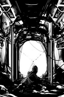
Finally someone has created a worse train ride experience than Estancia. Paper.Eleven is part of Daniel Kim's Clone Manga series which is a great dark slab of surreal manga with some of the most delicate linework I've seen online. When you see the ammount of quality manga he's done you'll think the bloke is a living marvel. I like the gleaming darkness evident here and the sheer scale of the micro-detail is above and beyond the call of artistic duty. I think using black and white (and shades of grey inbetween) adds a constriction that forces the artist to work harder. The puzzle of a narrative also quite tickles my fancy.

There's so much unseen experimentation happening on the fringes with mangaesque webcartoonists that is typically ignored. If a mangaesque webcomic does break free from the pack (aka, Megatokyo) the webcomic critical community doesn't understand it and the rules of the genre and josh it as mere emotive trash. Visually, this is one of the best webcomics I've seen this year and the minamalism present in its storyline pleases me greatly.

(Audio Accompaniment: DJ Signify's Sleep no more, dark noir beats with both Sage Francis and Buck 65 on the mike, totally ace.)

Mysteries and hysteria


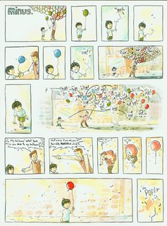
I don't know why but against my better judgement I really like the Minus strip on Kiwis by Beat, there's a childish simplicity here, it's like Counting Sheep done right, with lots of magical realism added to spice things up. It's a hard genre, the 'childlike simplicity' gig because it can often devolve into mere simplistic whimsy. Instead of going down this track some of the comics here are laugh-out-loud funny.

There's also the sadness present that is implicit in a lonely childhood that Ryan Armand truly understands. Boundless imagination is on display here and frankly you don't get this feeling from a lot of webcomics.

The use of shade is interesting as well, the colours aren't really copperresque intense but within its metier it works. It's filled with lots of pastels swirling around on a white background so there's no colour overload, just a softness floating on the screen.

(Audio Accompaniment: The Grates; Gravity won't get you high, heh, all that high-spun energy, florid colours and punky shouting, perfect.)

My MegaTokyo dilemma
I'm unsure as how to grade this latest strip from Megatokyo. This is either the Lovegirl mafia's first open move or Gallagher has really warped with the consciencespace/realworld continuum and decided to finally go buck wild on us. I think it is really the first option though, the world in which Megatokyo functions works in two streams, Largo's sci-fi Zombie/Zilla hyperactive world and Piro's introspective romantic comedy world. Gallagher hasn't ever fully melded these two streams together and I don't think he intends to do so. The inclusion of the CEA Sera into the real world would completely change the dynamic of the comic and make it far more chaotic, so I'm eagerly awaiting what this all means.


Some old School humour
Usually I try to stay away from printcomics on Zhi but I
think that
Barnacle Press is a good portal of old American comics that anybody with an interest in the artform should check out as a part of their visual education. (Unless you're a lame gamer freakazoid who drools out Leetspeak and other sub-vocal mangled rubbish.) As my childhood comic background is in TinTin and Asterix; it's a good eye-opener into the basics of American sequential art.
Now, milquetoast from The Timid Soul is not a word I have often used before but I think it will be now. The American Heritage Dictionary lists it as part of an ongoing osmosis between comic culture and general pop-culture:

The first instance of milquetoast as a common noun is found in the mid-1930s. Milquetoast thus joins the ranks of other such words, including sad sack, from a blundering army private invented by George Baker in 1942, and Wimpy, from J. Wellington Wimpy in the Popeye comic strip, which became a trade name for a hamburger.


Now if only 'sad girl in snow' became part of the general lexicon, then that would show me that webcomics have truly engaged with the general public's imagination.

Tuesday, 22 August 2006

Blood trickling through the canals: Verardi Famiglia


I think I'm going to enjoy Verardi Famiglia's particularly vicious brand of violence. Set in Venice, its emphasis on the misadventures of Valerio as he navigates life after betraying his mafia 'family'. Admittedly, it is hard to tell if this is going to be a great webcomic as there's less than twenty pages now written, however it looks as if Sires has a masterplan already set up. The addition of some Italian into the script is also a nice addition, it makes the strip less whitebread. There's a lot of complex perspectives here and some very clean linework. Hopefully it will develop into a consistent and violent Noir-style webcomic.

(Aural accompaniment: You know that really dodgy Ja Rule song, 'I think the rain is calling murder, I think the rain is calling muuurder!', the filmclip has Patrick Swayze as a corrupt cop and Irv Gotti trying to play hard as a gangsta, anyway, I think a corny song like that would really help because of all the violence in this strip.)

Monday, 21 August 2006

Darkness at the edge of town: Either way, Blue Zombie & Jump

I don't know why I'm attracted to horror and supernatural themes, I was raised as a Pentecostal so there must be some kind of nascent spirituality underneath all my neurotic agnosticism. I seem to be attarcted to genre fiction because all that slice of Life Stuff out there isn't really good for webcomics in my opinion. Lately, horror webcomics seems to be a good springboard for emotional intensity in a way that fantasy hasn't been able to do so far. So, here are three webcomics that use horror as a springboard for something else.


Either Way made a false start but I quite like the look of the artwork and where the story could be heading. It uses the supernatural as a backdrop to various dramas and it adds some sly humour to what can be a particularly dour subject. The level of cross-hatching is pretty heavy and I think Nekko started off with Blacklight Twilight as a trainee comic and moved on to this one once she was confident enough to do so.
I'd seen her around on
comic genesis and I'd been put off by BT but I think this webcomic is good enough to launch her into something different. The creator's emphasis is on how horror impacts on real life, so it's traumatic thriller and a slice of horror on the side and enough self-consciousness to drag it out of mere genre-fiction status.

(Audio Accompaniment: horror and weepy tendencies, so, The Arcade Fire: Funeral)


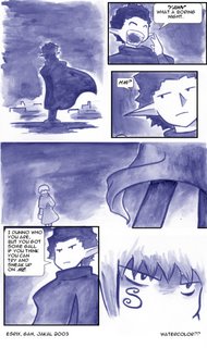
Blue Zombie has a lot more back-story to it than what it looks like at first glance. It's mangaesque without overtly showing any influences, it's also able to transform blue into a gothic colour and I also like the clean level of shading here.

It also keeps on alternating between bleak streams of consciousness and goofball adventures. It's an alternate version of our world with all its real-world problems with the intricacies of magic and demons added to make things just that little bit harder.

Also, the
character section is essentially a how-to for upcoming webcomicker's, it's really dense with information, now if only Fred Gallagher was willing to learn some new tricks...

(Audio accompaniment:um...really ashamed to say this...Portishead; Dummy, mellow depressed menustrating women, yep, bet all you blokes are really uncomfortable now...)


Of the three horror webcomics I've been looking at,
Jump, is probably the bleakest in terms of narrative texture. It's also the most stylised artisically and the one more in keeping with the conventions of the horror genre, but if you read through you'll see some sinuous sleek magical realism hidden underneath, it's dark and seething with neurotic desires. Even if you have to wade through the pencil sketchy style at the begining, the lushness of the colour added later on adds some Wildean glamour to a narrative filled with the tropes of sin and redemption.

(Any thing by My Red Cell for some really psychotic violent tendencies)

Tuesday, 8 August 2006

I wish my cat was as cool as Mr. Pickles!: Lola, Wasteland, The Dreamwalker Chronicles


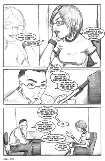
Victoria Smith has pulled off an unnoticed coup in creating Lola, the strips are somewhat self-contained but also lead on to a continuing narrative, obviously I've been entrapped by the gothic meanderings of Lola's existence but it's the slow subtle build-up of the story that really impresses me. It uses a bleak style, all black and white and very minimalist. There's hints of an anime fluidity here but I like the fun behind all the gloom, Lola's just trying to work things out, if the story-template is gothic then Smith veers away from that pretty well, it's more a journal of an alternate version of Smith's teenage angst years. It's very successful in its balance between kitsch and deliciously morose teen ramblings.

(Aural accompaniment: this is one webcomic that is able to take the playful moroseness of the Smiths, so, The Queen is Dead.)


The Dreamwalker Chronicles is a narrative concerning a small boy who finds himself in the woods and some distorted fairytale version of our world. The use of colour reaches a Copperesque sheen and the fantastical logic behind the story really impresses me.
It's as if all of childhood's creepy darkness has come to us in sequential art form and we have to decode it! The inclusion of native American mythology also adds another layer to what could become a dense and subtle work. The monsters have climbed out from under your bed and are now getting proactive about catching you! Delightful stuff!

(Aural accompaniment: So dreamy and melodic, The Coral; Magic and Medicine.)


You probably haven't heard of
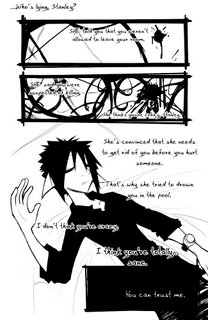
Wasteland but this is a good example of psychological distress and sexy sketchy mangaesque mystery. There are so many tangents here that I don't know where to fully start! It retells a crime scene from a number of angels, it's full of fortellings and dour murderous dreams and pale fey youths moping about, It's like a guilty pleasure and the artwork is a sketchy black and white style, there's so many red herrings but I guess I prefer chaos to a petite narrative. I still have no idea about what's fully going on after the end of chapter two but I 'm truly enjoying putting the pieces together.

(Aural accompaniment: Emo sad, crazy linework, screaming ex-Can member crazy, Sixtoo; Chewing on glass and other miracle cures.)

Tuesday, 1 August 2006

Horror comics get vicious: Agnes Quill and Revenger's tragedy


I only occasionally look around at all the decay that the webcomic community has to offer and it occurred to me that my viewing habits weren't as broad as they could be, we always put up various biases between ourselves and new experiences and it's sometimes hard to get out of a webcomic rut, so I went looking...

The multi-authored approach to
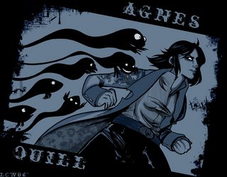
Agnes Quill creates a sense of the underlying character, the artists that Dave Roman works with all operate using a lush template that suits the particularly baroque world-view of the writer.

I usually don't read adventure webcomics, even though I was brought up on various Francophone Ligne Claire style adventure comics I've felt that nothing has ever lived up to Tintin and I thereafter neglected the genre. Either that or I saw the usually shit selection Keenspot has and that turned me off for life (That or
Everything Jake got way too emo and tainted me for life.)

But AQ doesn't use the usual static clean lines I'm used to and regardless of the artist, there's always a sense of movement here. The artwork is a stunningly rendered black and white rendition of a complex world and the creator's own cartoony version set out in story-lines such as , 'Invite only', add another dimension to the strip. So, it's horror and mystery mixed up together and once you get past the initial unsettling acceptance of the undead then it becomes a good plot-driven read. Slave Labor Graphics is putting out a AQ anthology and I'm going to try to pick it up if at all possible.


The gothic aesthetic in webcomics usually exists in a morass of linework and that's usually a good thing, thus, I additionally like the way
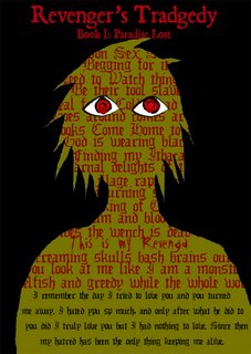
Revenger's Tragedy uses various typefaces, for example:

As it stands, horror seems to add an edge to artwork, it adds vistas that would otherwise be unseeen, it can also go all Poe and stifling on us but the majority of horror webcomic writers look like they know what they're doing, horror might not have the cachet of arthouse webcomics like Cat and Girl and a lesson is learned... but these two webcomics impress me mightily. RT takes off where Dante's Inferno left off, it's an ambitious examination of how an underworld would work in practice and if Smith isn't as crash-hot at human bodies, his backgrounds have an expansive feel to them that carries the whole work, his artwork doesn't look like anything else, it's sometimes more like art connected to a story. It sometimes looks sketchy but sketchy can be good sometimes, some webcomics have too much of a polished sheen to them. The early exposition is heavy but you can hardly explain the geo-political scheme via pictures, overall, a good solid webcomic.

Monday, 24 July 2006

Busting up da flow: Combustible Orange


I'm not a real big fan of Penny Arcade and I don't think Becky and Ben from Combustible Orange are either. As for lyrical analysis: it looks like Tycho is going all 1992 west coast on us, the rhyme scheme is basic but the clothes are skankily wiggerlicious. The bling is pretty good though, if you're going to front on the bling you have to go hard or go home ( I mean, Flava Flav rocks his clock like a drunken telemarketer and everyone loves him.)

I really dig the clean design of the CO website and after the 'reboot' the linework has become more mature and the humour has become far more subtle. It's essentially a dig at the comic industry, thus, the Jhonen Vasquez piss-take was also pretty apposite (heh, stabbity stab!)

Tuesday, 18 July 2006

Does the bandage on the face mean he's a shit rapper like Nelly?


As an Australian I'm proud to see some antipodean influences on an American dominated internet. Anyway, it looks like there might be a new webcomic collective coming up! Koala Wallop is going to collect together a number of webcomics that I'm currently excited about.
It will contain webcomics such as:
Dresden Codak New surrealism and beautiful, evil science.
Perfect Stars Bitchy fashion and Wildean languor shouldn't work in a webcomic...but this does.
I am a rocket builder Really clever use of hyperlinks.

(Seriously, Nelly goes platimum or whatever and Bun B gets the consolation prizes? Make it stop...)

Dirty pixels: In the webcomic ghetto


Abstract: This is an examination of how a webcomic's popularity stems from its friends.

If you look at the structure of webcomics today it's clearly the smaller collectives that are the most visible,
Keenspot still continues to lumber on, dutifully creating a monochrome slather of unconnected webcomics. The boutique collectives such as Dumbrella, Boxcar, Blank Label and Dayfree Press, all band together, it's a team effort that pays off via goodwill.

A number of the more popular webcomics based on these collectives are the result of years of work, they're more established and they're the product of 'trainee strips', John Allison could only start on Scarygoround after Bobbins, really. The trainee strip isn't a conscious decision, the web-cartoonist merely moves on from it when they realise it is not flexible enough for their new ideas.

The first hundred strips are pretty tough for the web-cartoonist and sometimes painful for the reader, just look at the first unsophisticated 100 strips created in Questionable Content or Sam and Fuzzy. Persistence wins, If Bobbins started now in this new competitive environment do you think it would be as popular as SGR?

There's a whole skanky underbelly of unloved webcomics out there and sometimes I feel guilty for sticking to the comics created by the more experienced webcomic creators. I guess my 'discoveries' section is my way of assuaging my guilt. The collective webcomic critical consensus has already created a canon of webcomics and a number of webcomic in that canon are on the boutique collectives. I know they're dependable but I'm wondering how the next generation is going to get through the undergrowth.

Saturday, 15 July 2006

Elephants beware! Girly: Part one - The Sidekick


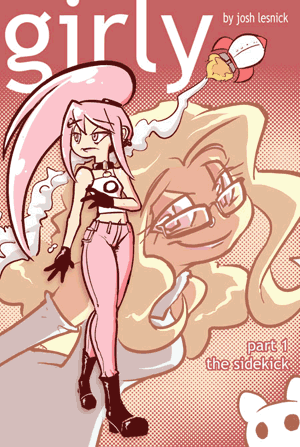
I copped this last week, it collects the first 122 Girly strip and gives them a thematic wholeness that you might not otherwise perceive. This is a good thing because Lesnick has always added a moral proportion to his characters and I guess Girly is his attempt to create something of emotional intensity after his 'trainee strip' Cute Wendy ended. He does chaos well and the fluid mangaesque style creates a comic that can easily move between joyous and sorrow in an eyeblink

Reading through these strips as a whole, one can see that there's also a sense of moral proportion underneath all the hijinks and japes. Aside from some additional art in the margins there aren't that many extras and at first it feels odd to read two strips per page but once you get over that,you'll be reminded why you fell in love with this hyperactive strip. If you're not a convert then this is a good way to get into a crazy adventure.
(and not in the juvenile Neo-Soul-coffeetable Gnarls Barkley style either) adventure.

Monday, 10 July 2006

Print/web comic crossover: Flight 1


Okay, perhaps I'm a little late here but I think that Flight 1 is perhaps one of the slickest print trade paperbacks I've read in some time. The paper is callandered really nice so the colour really shines through to create something fully shmik. It also got me back to looking at Kazu Kibuishi's Copper and I appreciate that. It's a fusion of print and web comics, Kibuishi has edited the collection and if not completely thematically in tune, it shows a sense of adventure that most comics don't possess. Ideas swirl around and there's no bog-standard fuckwit gamer comics here, just the fantastical and the magical.

Most of the artists have art-sites as opposed to webcomics or otherwise write strips intermittently. Interestingly, Scott Mccloud is also present as a mentor and isn't as pretentious as he usually seems. A good introduction to some talented artists that are somewhat unknown.

Monday, 3 July 2006

Sad without the Emo: Neilcomics

I recently discovered Neil comics and I think it's a good source for print comic gossip. Okay, maybe overall the archives might be a little small but I like the melancholic disposition displayed here. Most of Neil's comics are on Girlmatic and this is essentially a clearing house for news and gossip.

It's a little photo-heavy and is filled with industry chatter but I'm a convert because the stuff he did for Flight is pretty amazing. Look under
'Stories' for his comics, he makes up for the small amount produced by his sincerity.He's also pretty funny as well, the Sacco and Zetti stories are the visual equivalents of summer. Now, if only Jhnonen Vasquez were so upfront instead of putting up hack websites with no content.

Thursday, 29 June 2006

One black heart broken in two: Stuff sucks

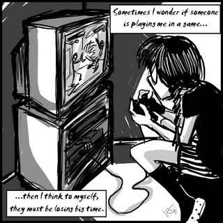
Stuff sucks has 'it', this fantastical Amsterdam inhabited by English speaking ex pats is a weird place. The 'it' is the whole sluttish mix of different characters. If the artwork somewhat resembles Return to Sender, then the narrative is a free-flowing haze of emotion and japery. (Though Zemi is like a skankalicious version of Colette) I like the looseness here and the willingness to explore sub-plots. It's also what the strip doesn't do that makes it stand out. Liz Greenfield could have added in the goldfish as a talking mascot goldfish but she didn't, she showed restraint.

Heh,
this strip has the emo kid, Adam, twisting the whole Emo vibe around. He should be a recurring character.Usually the Emo kid gets a bad rap, Nothing nice to say uses the usual stereotype.I mean, I hate Emo kids, All American Rejects makes me want to hit frogs with a hammer, Dashboard Confessional makes me want to bring public crucifixions back as a spectacle. But I think the Emo kid is good in this strip, Liz Greenfield didn't go down the obvious route and that's always a good thing.

Monday, 26 June 2006

Discoveries: Edwitch


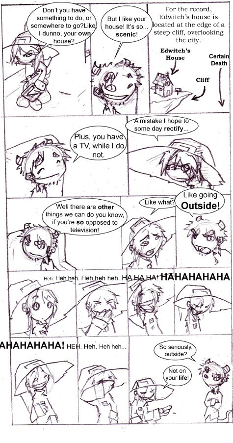
I first found out about Edwitch via Scarygoround as Josh Rosen did a strip for Scarygoround idol.I like the sketchiness of the artwork, it gives the strip a looseness that is quite welcome. There's a sense of childhood moving onto twenties and thus it's a charming read because I usually am converted to a strip based upon its evocation of a fantastic world, it's mis-en-scene as well as character interation. Gaming comics don't usually provide this, instead it's usually in-jokes and bumble-fucked misogyny. I prefer the liminal spaces between normalacy and the fantastic and Edwitch easily provides that.

The gothic is also a preoccupation of mine and Edwitch would not look out of place on the Slave Labor Graphics roster. It's the gothic crossed with slice of life humour. Usually gothic visuals are accompanied by varied lush backgrounds. Here, the minimal backgrounds gives the strip a sense of space and lets the characters perform as themselves, I like that.